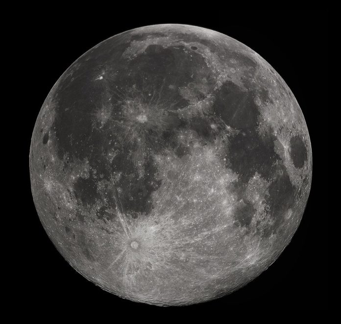
The moon has been the object of fascination for the most audacious explorers amongst us. The mere thought of a human setting foot on the natural satellite has sparked support as well as opposition for a long time. It is no wonder then that the act of putting the first humans on the moon is considered the greatest achievement of the human species.
The astronauts piloting the mission will perhaps be remembered for centuries as the pioneers of the human exploratory spirit. The moon also serves other purposes on our planet besides being a show and tell achievement. It also harbours some unique resources that could hold the key for us to take the next step in evolution.
All this requires a comprehensive and detailed knowledge of the celestial body. To solve this problem, researchers have come up with a detailed map of the moon with unprecedented detail. The moon, which oddly looks like it has been playing paintball in the map, was assembled as a whole in the map from six different lunar maps that were created during the Apollo era. The USGS compiled lunar map is called Unified Geologic Map of the Moon. The different splashes of colour identify a discrete rock or sediment formation, which consists of craters, basins, and even ancient lava fields.

The compilation of the map was no easy task. The different lunar maps used to compile this lunar map did not align. Their edges weren’t exact, and the labelling was sometimes different, or the description and ages didn’t match up. The new lunar map is not only a collage of Apollo-era data, but it also includes new data from the myriads of moon missions that have taken place ever since. The modern data includes the poles, north, and south, which were captured by NASA’s Lunar Reconnaissance Orbiter, and the area around the equator was filled up with the details collected from Japanese Aerospace Exploration Agency’s SELENE lunar orbiter.
The discrepancies in the different Apollo era maps arose due to the different interpretations of the different research teams that made them. It is quite possible that two different teams could have drawn different conclusions by looking at the same photograph. The team reconciled the discrepancies by looking at all the six different Apollo era maps and also taking the help of the modern data to decide what the actual identity of these features was. The modern data turned out to be much more helpful in deciding on points of contention such as the age of the craters as more detailed images enabled the researchers to figure out the details that they simply couldn’t have with the Apollo era data.

The implications of this map are huge, as a new round of moon missions is being readied; this map could come in handy when trying to make decisions related to the moon’s geography.
Further Reading:


